case studies
1
Antioch University
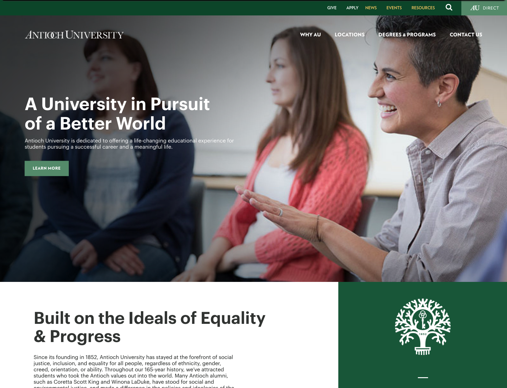
When the university determined it was time to eliminate five separate campus sites in favor of one, I became part of a small team in the Marketing Department to oversee the project.
As the most experienced creative and marketing professional in the University Marketing Department, the Vice Chancellor relied heavily on my expertise and insight to help envision how the site would look and function from both a user perspective and as a central component of lead generation. As a team, we also needed to grapple with the overarching university brand and the loss of four somewhat distinct, but related campus brands.
The process included the identification and study of user persona. This work indicated the UI design needed to include several overlapping layers of user persona and use cases:
Degree level (bachelor, master, doctorate)
Focus of study
Geographic region
Age and phase of life
Educational delivery mode (on campus, online, hybrid)
The project’s heavy lifting was done by a hired outside agency, However, my experience, which included prior A/B testing of landing pages, analytics reporting, Google advertising oversight, and overall design expertise influenced the entire project significantly. In part, this was due to the fact that the agency came to understand that the University had someone with significant expertise in-house.
This became critically important when my analysis concluded that upon the shut-down of the five campus sites, the university would likely lose page and domain ranking, which would result in a significant loss in lead generation. I subsequently developed a program of Google Ad landing pages — writing, designing, and building the first 40 over the holiday break. Later analysis proved the endeavor worked to help the academic departments maintain much-needed inquiries.
2
Poodiack Wealth Management Group
This family owned financial planning firm operates in a partnership and in conjunction with two other financial planning firms. As such, all marketing/promotional projects must be processed through two layers of compliance, making marketing initiatives like websites and printed material more complicated, restricted, and time-consuming than they might otherwise be.
I was hired to design and build a new website for them on the required platform and with content restrictions and guidance from the managing partnership. In addition to compliance restrictions, the site could either be produced using the somewhat arcane CMS, or could be hand-coded. In order to maximize flexibility and branding opportunity, we chose the latter. The result, https://poodiackwealth.stewardpartners.com/ is a bespoke html/boostrap site I designed and hand coded. I also wrote the copy.
Auxiliary projects during the site development included Calendly forms, video editing, and the creation of various pdf guides.
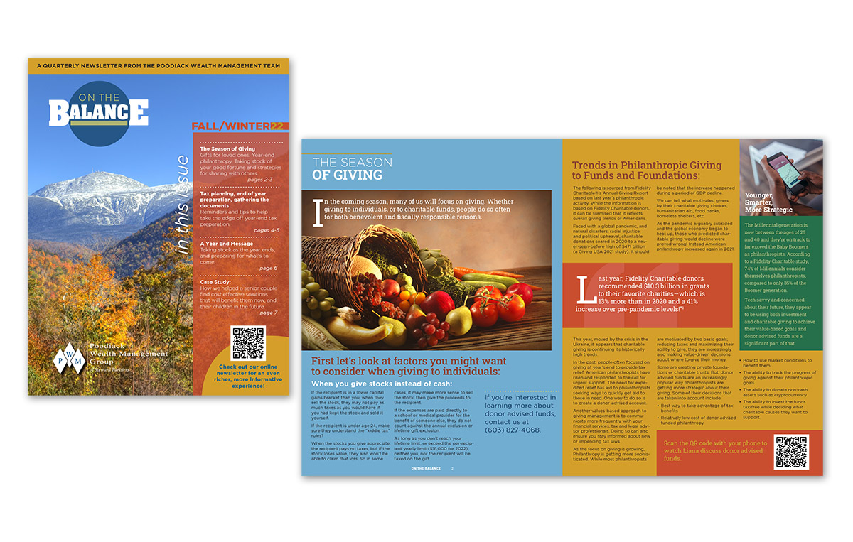
Subsequent to the launch of the site, I wrote, designed and produced a new newsletter for the firm in print/pdf and web form.
3
iDolls
It was 1999, but we weren’t partying like it.
Billed as the “world’s largest doll store”, the founders of this venture-capital-backed company had projected we’d be enjoying a significant percentage of the world’s doll market sales within 5 years.
As Creative Director, it came to my attention that they unfortunately hadn’t done adequate market research. So I did… and found that the average doll collector (the target demographic) was a 53-year-old woman who not only didn’t shop online, but didn’t even own a “home computer”.
The company was really up against it, and that was before the looming dot-com bubble burst.
I studied the persona of the doll collector. I learned s(he) was highly romantic, sentimental, and passionate about his/her hobby, often isolated from other collectors, yet yearning to commune with those who shared the passion.
If we were to reach them, find early adopters and grow a loyal customer base, we had to craft a message with their persona and interests in mind and use traditional media to disseminate our message.
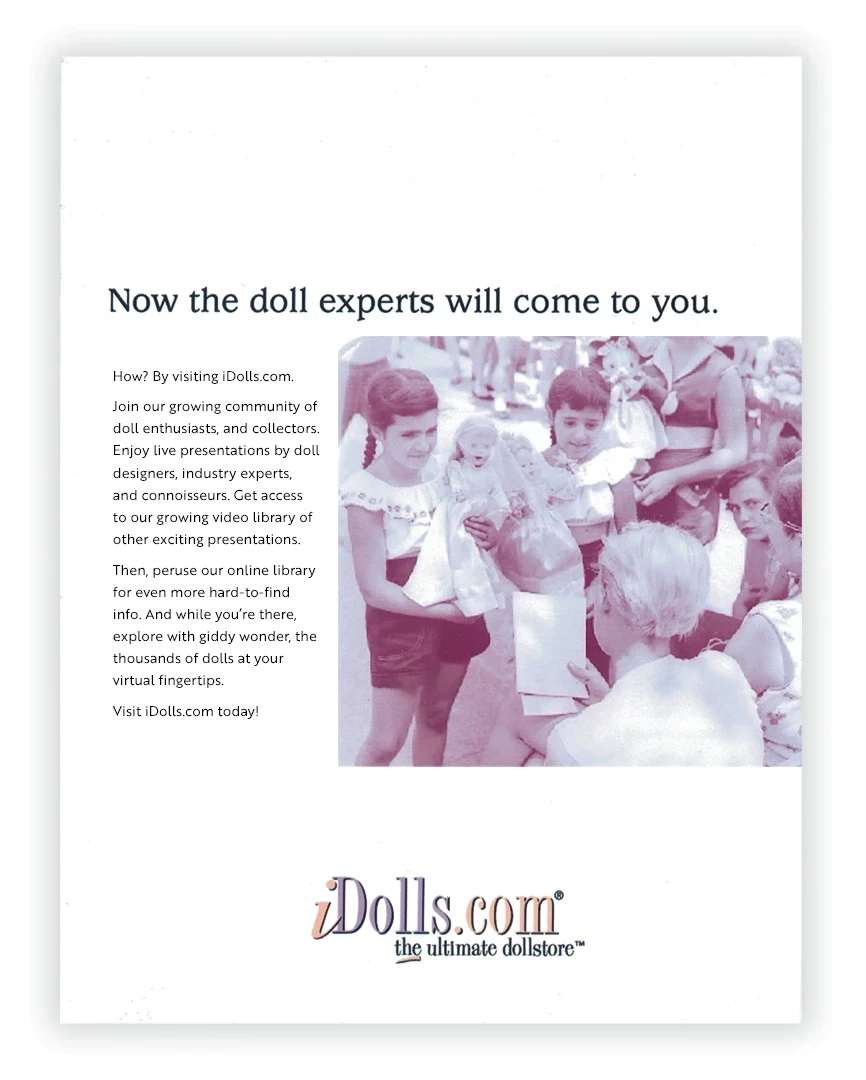
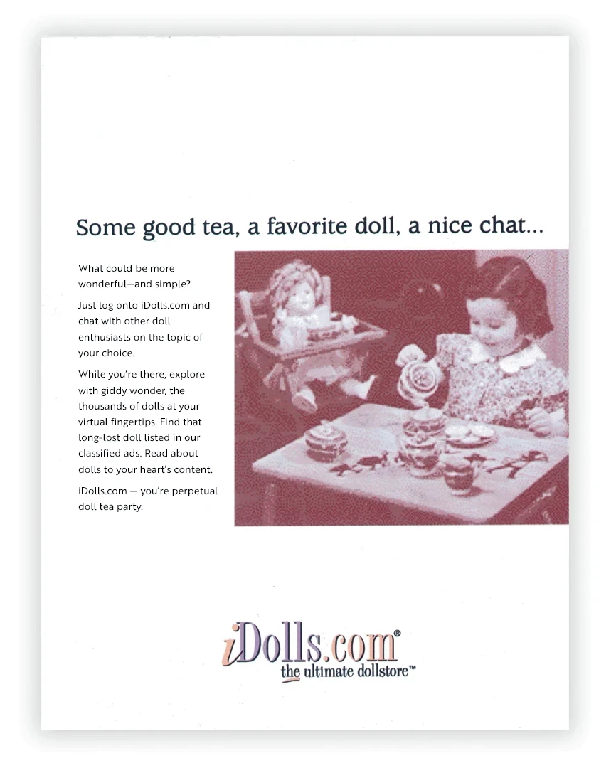
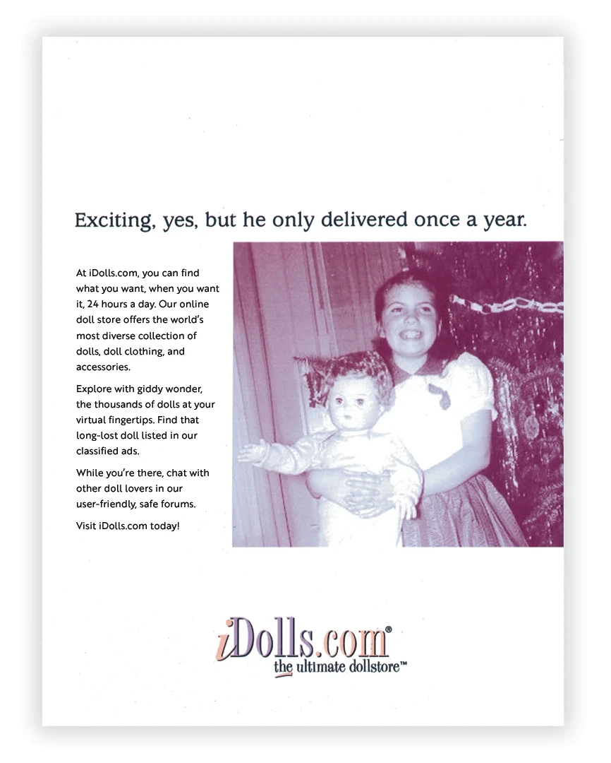
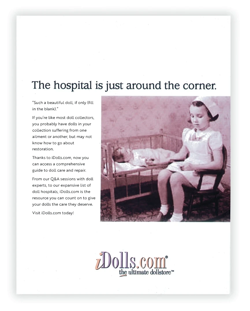
Luckily, iDolls.com WAS more than a doll store. We were building a lot of interactive features to engage doll collectors. I developed a series of ads for doll collector magazine placement that I designed to become our central brand story.
Unfortunately, this story doesn’t end well. We simply could not meet founder’s early promises to the investors quickly enough, and when the crash came in 2000, the company closed.
While I can’t report success in this case, it’s an example of my ability to…
- think like a marketer,
- research, identify, and analyze target persona,
- develop creative strategies,
- build brands,
- envision and craft storytelling,
- develop advertising that reaches the customer with engaging messaging that directly addresses their motivations and pain points.
4
Pog Apparel
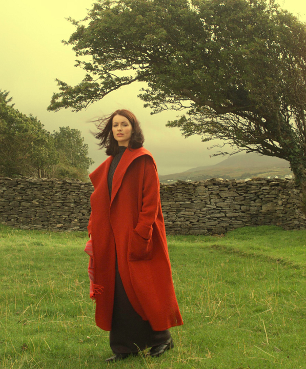
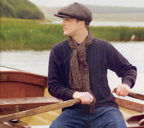
I was my own client on this project. The objective was to create an online store for handwoven and hand knit apparel from Ireland. The rich opportunity for storytelling was as boundless as the Irish culture itself. The intention was to weave the stories of the creators into everything we featured… hand dyed and woven fabric from sheep just down the road. In so doing, speaking also to the spirit of the place, it’s natural beauty and traditions.
5
Bendos™
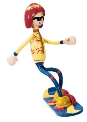
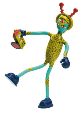
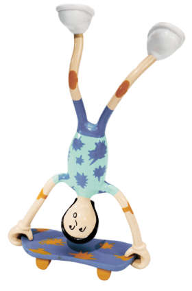
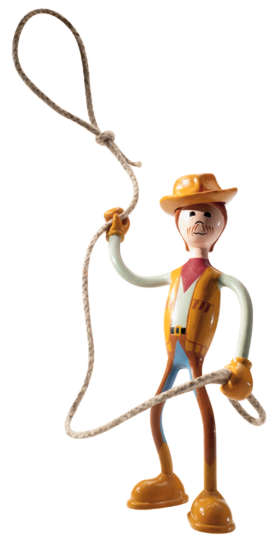
As Art Director Kid Galaxy, a toy company, I handled all their print design needs. Frankly, I never expected I’d be given the opportunity to design the toys we sold. I also didn’t expect the incredible following and viral marketing that resulted.
These quirky, non-violent action figures won the hearts of millions of children and adults, and for a time, were the number one, best selling toy in the specialty retail toy market across the United States.
They also received the accolades from the toy industry, earning Dr. Toy, Oppenheimer, and Parenting Magazine toy awards for several years in a row.
6
Video Editing
A previously-created very long video needed to be parsed into shorter segments with focused topics. But the original project files were no longer available.
The solution involved careful sound and timeline editing to sync duplicated sound snippets in order to create smooth intros and outros for the shortened segments.
